
Year
2024
My Role
UI/UX Designer
Responsibility
End to end UX/UI design
Overview
WEBA is a no-code platform that helps users quickly build interactive web pages, with the slideshow being one of the most frequently used components. However, the original design lacked intuitive workflows and flexible style settings, making it difficult for users to edit efficiently or customize the layout as desired. This redesign addresses those issues by improving the setting structure and interaction flow, enabling users to create layouts that better fit their needs.

Design Strategy
WEBA users, mainly marketers and designers in banking and insurance, often need to build campaign pages quickly.
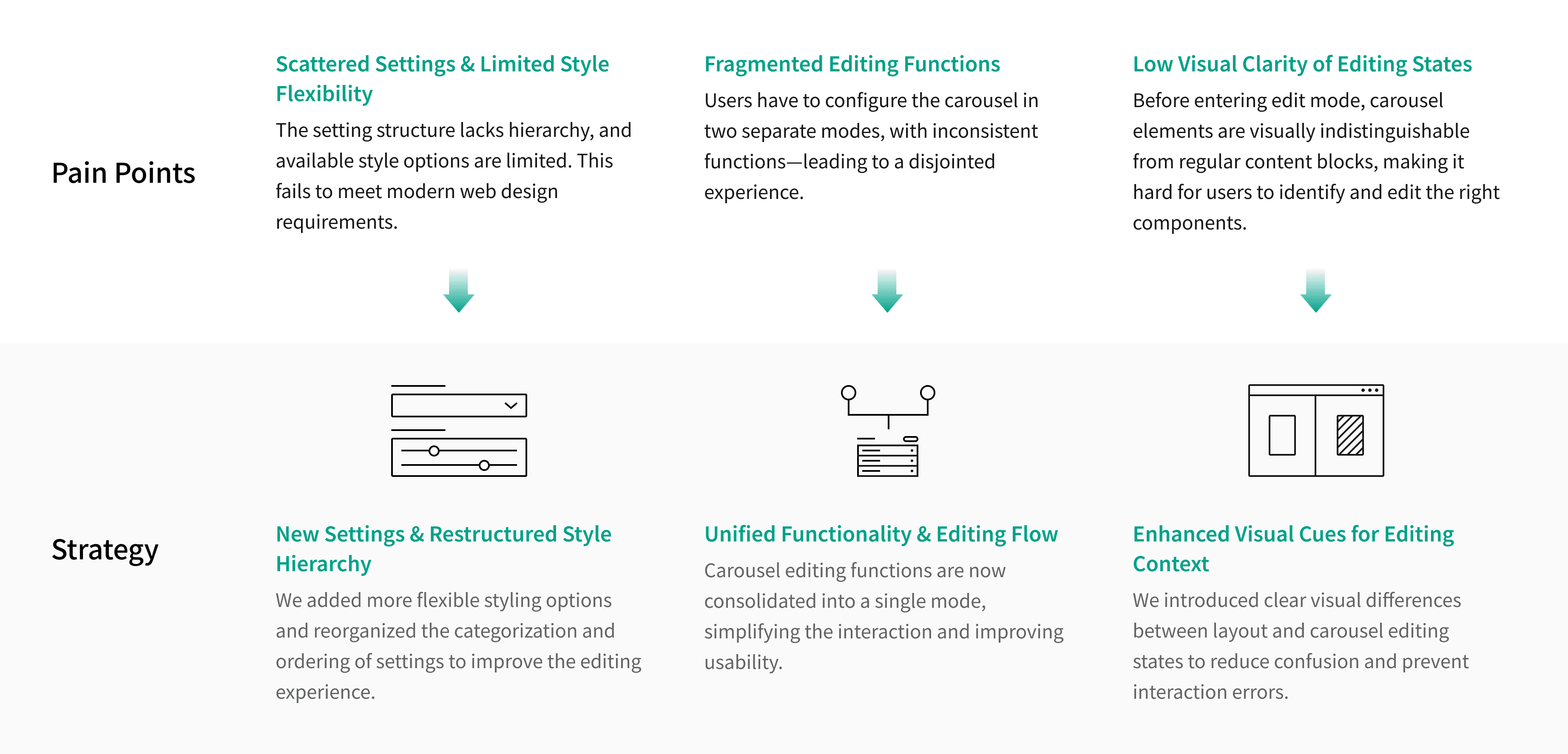
Drawing from our platform experience and user feedback, we identified three key usability issues.
We then redesigned the carousel component to streamline the editing process and offer more flexibility in visual customization.
Principle
I followed these key design principles throughout the redesign process:

Solution
Enhance Customization Flexibility & Editing Logic
The original settings were scattered and hard to use, limiting style flexibility. We reorganized them into Slideshow and Style sections, and added options like corner radius, arrow style, and navigation dots. These changes make it easier for users to adjust the component’s appearance and edit more efficiently.

Streamlined Editing Flow
Users previously had to switch between modes to configure and edit blocks. We unified the workflow into a single mode to reduce interruptions and improve focus.
We also refined the block naming logic, changing labels from “Block,” “New Block,” etc., to “Block 1,” “Block 2,” making it easier for users to identify and select the content they want to edit.

Clear Visual Feedback for Edit Mode
Previously, there was no visual difference between canvas and slideshow edit mode, making it hard to tell the current state.
We added a semi-transparent overlay and disabled interactions on non-carousel elements to help users clearly identify where they are editing.
