Year
2025
My Role
Visual Designer
Responsibility
Branding design, Website design
Design Concept
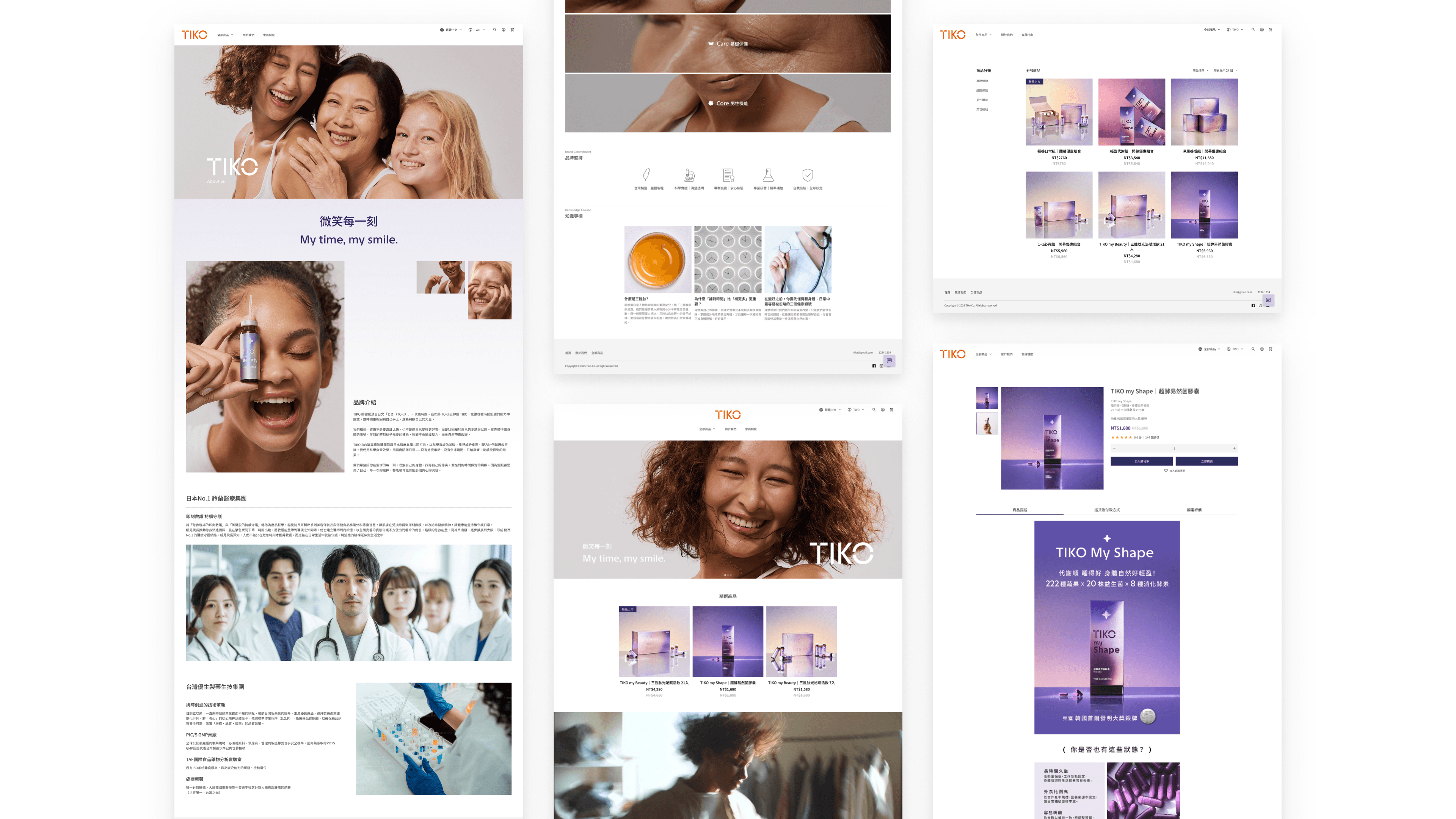
The visual core of TIKO stems from a reinterpretation of "Time." By flipping the Japanese word "TOKI" into "TIKO," the design symbolizes reclaiming agency from the chaos of daily life. Through minimalist geometric lines and rhythmic layouts, we translate a professional medical background into an elegant lifestyle aesthetic. The design goal is to eliminate the anxiety often associated with health management, turning "self-care" into a natural, warm, and daily ritual.